Data vis – stories with numbers

DOWNLOAD: our guide to good data vis
The best data visualisation is priceless. It can make the simplest data relevant and arresting. Or extract the essential story from a vast, complex dataset.
We’ve all seen those million-cell spreadsheets. Stare at the detail for too long and it can feel like you’re drowning in digits, floundering in figures, lost in logic.
The art of much data visualisation is to find the story within the statistics. Focus and then expound. But then sometimes you need only present a wealth of facts with utter clarity. Invite your audience to interpret the data and find their own patterns within an illustrated story. Draw conclusions they could never have anticipated on that spreadsheet.
Animations with commentary, showing developments over time and pinpointing key moments, bring subjects to life in a way no static execution could.
Too often, however, data vis is merely gilding the line graph. The simplest of bar charts and scatterplots have endured with good reason. But what are the strengths and limitations of the alternatives?
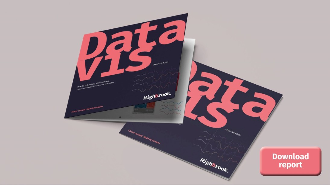
Highbrook’s Data Vis Creative Book will help you choose the data vis to suit your needs.
Among the questions it answers are:
- What makes good data visualisation?
- What sort of numbers do I need for data vis?
- What types of data vis work best for my needs?
The harmonious combining of illustration, statistics and text is alchemical. Find the right combination and it will impact and longevity far beyond what each can achieve on its own.
Download our guide to data vis by clicking on the image at the top of this article.


