The cult dedicated to Windows Vista

Why this new wave of corporate nostalgia?
Tastes are cyclical. We constantly see music genres, clothing, architecture and interior design styles rise, fall and rise again. Now we can add operating systems to that list.
Frutiger Aero may seem like a new term to you. That’s because it is. Although it roughly describes numerous user interfaces between 2005 and 2011, it wasn’t coined until 2017. Frutiger Aero features a distinct design style that’s chunky and has depth, with glossy, blended colours and textures, blurring to create space, and a weird melding of the natural and synthetic. There’s a vague harmony and optimism to it. If you see it you’ll know it.
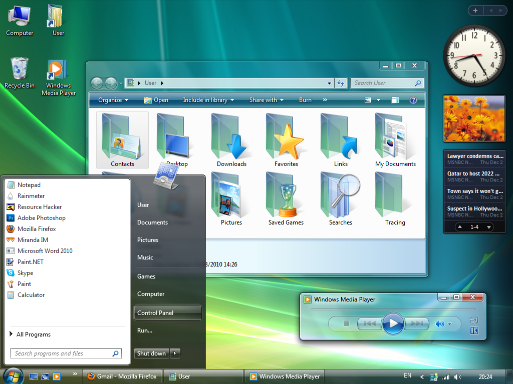
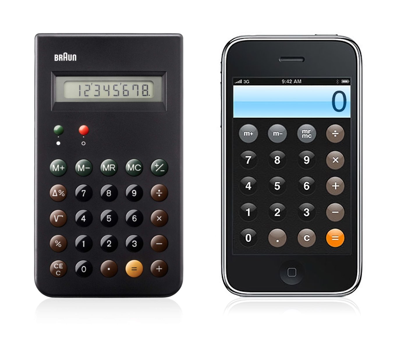
A key element is the concept of skeuomorphism. Skeuomorphs are objects that retain redundant aspects of earlier iterations as decorative features – think heaters with fake flames, electric lights on chandeliers, or clickable buttons that have been given the “depth” of physical buttons. If your goal is to make the future less daunting and abrupt, skeuomorphism is a helpful technique to enlist.
We are fashionably late in identifying this trend: it has been reported by various publications since 2022. One Reddit page dedicated to the look has more than 40,000 members, and TikTok videos on the style enjoy several million views.
People are generating artwork inspired by the technique. Some are even reverting their computers to older OSs such as Windows Vista.
Admiration for the design aesthetics of an outdated operating system is a new phenomenon. The fact that it’s an explicitly corporate nostalgia is equally notable. We’d understand a revived interest in, say, Peter Saville or Jamie Reid – but a top-down entity like Microsoft…? It’s a clear demonstration of just how much computing has become part of our identities – and the power of the design teams in the field.
Why now? The easy and more boring answer is looking back at this era as a more carefree time, without the confusion (dare we say) dread of today. But it also reflects a reaction to the prevalent aesthetic in UI and the corporate style playbooks today.
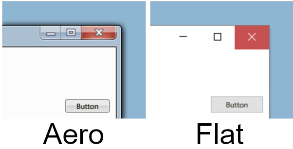
Highbrook has previously written about Corporate Memphis. This is the flat, slightly naive illustrative style that dominates much software. Frutiger Aero and Corporate Memphis – both terms coined by observers rather than practitioners – have more in common than appears. They both try to bring familiarity and warmth to tech, finance and other opaque industries.
But people are drawn to Frutiger because there’s far more room for maximalism, experimentation with perspective and an alluring 3D feel. The style has what you could call a different metaphysics, too, in which images, CGI and illustrations happily co-exist.
You get the sense that, back in the 2000s, designers were making the most of new software and tech. Now, prompted by limitless photorealistic AI images, some are beginning to believe the minimalist, 2D illustrations of today look like a step backwards.
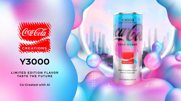
Will this renewed interest in the style have any sort of (im)material effect? We see it as a fad but suspect that some elements – such as the clash of illustrations and images, or the 3D look of buttons – may filter through. Recent ads for Coca-Cola’s limited-edition Y3000 drink, complete with AI-derived imagery, do have a smooth Frutiger feel to them. But knowing the complex webs of stakeholders in large companies, we think it may be a while before we start to see the style return more widely.
Get our newsletter for insights into modern comms