Design style that ate the world

Corporate Memphis is watching you
It has slowly come to dominate digital visual culture and is now conquering physical posters and signage. Its banal signifiers are gleeful but nonspecific human figures in blissful harmony with their surroundings.
It has a name: Corporate Memphis, after the furniture group at the centre of a 1980s’ post-modernist design movement. Other appellations include Globohomo, short for “globalised homogenisation”, and the Big Tech Art Style.
How to identify Corporate Memphis in the wild
The scalable, vector-based style is characterised by its reliance on flat, geometric shapes, which are easy to create and easy to read. Rather than individual identities, the exaggerated personages who populate the Corporate Memphis universe embody concepts.
The figures are never static; their oversized, wobbly limbs are always in motion. They often interact with objects: mobile phones, plants, computers, calendars. A typical scene depicts these characters cavorting through a Utopia, the pastel tones more in keeping with Easter eggs than algorithms.

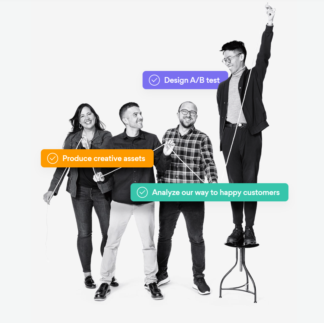
Asana's Corporate Memphis design
A modern phenomenon with historical ties
Corporate Memphis is perhaps the natural outcome of the trajectory towards simplification that graphic design has been following for decades. While it may appear a distinctly 21st-century phenomenon, the style can clearly trace its roots to modernism, one of the most influential societal and cultural movements of the late 19th and early 20th centuries.
The technological backdrop of the illustrations masks the characters’ resemblance to the fluid forms of Matisse and Picasso. Parallels are also present in Bauhaus and the Art Deco posters of the 1920s and ‘30s.
Where big tech treads, criticism follows
Facebook’s adoption of an illustration style called Alegria in 2017 sparked the explosion of Corporate Memphis. Named after the Spanish word for joy, Alegria was designed to evoke positivity and human connection.
The artists behind Alegria wanted to portray the sense of jubilation and higher purpose that can arise from a community’s collective output. To do so, they attempted to make the characters secondary to their actions. Hence the focus on objects and movement.
The art’s accessibility and replicability have made it a natural fit for companies looking to fill space and add character to their websites, apps and SaaS products while projecting a friendly image. However, design critics and internet cynics alike have been quick to point out that its inoffensive portrayals of Utopia look more like the onslaught of technological domination hiding behind a veneer of benign cheer.
These detractors may soon have reason to celebrate: there are signs that tech is moving away from the source of so much mockery. For instance, the website of the entirely benign workflow management platform Asana, where artistically rendered characters like the woman pictured above once bookended the content, now depicts real people. Does this mean we’ve passed Peak Corporate Memphis?
Asana's new design