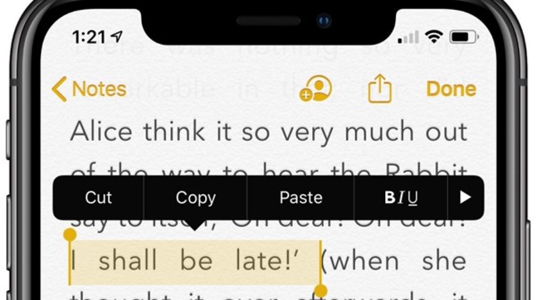
Hate mobile text editing?

There is a better way but don't expect it soon
If you’ve ever tried to edit a text document of more than a few lines on your phone, you might be aware that the exercise can get very frustrating very quickly – especially for those with large fingers or without hyper-fine motor skills.
When designing their phones’ user interfaces, both Android and iOS essentially just copied desktop text editing conventions. However, they were unable – or unwilling – to translate the menu bar and mouse to the smaller touchscreen.
This original sin has lead to some common problems, including:
Cursor placement. During an admittedly small study, it took users an average of five tries to get the cursor where they wanted. One participant had to tap 19 times.
Magnification. It can be useful, but the icon often gets in the way of what you’re actually trying to see.
Gestural ambiguity. What does a “tap” mean? On current operating systems, the answer is several different things.
Menus. Or rather, a lack thereof. Pop-up menus on mobile devices are hard to access due to the aforementioned issues with the tap gesture, and even when they do appear they miss out on key functions.
There are fixes for these problems. For example, the clever people behind Eloquent have developed elegant solutions to these annoyances and others.
They’ve introduced a fisheye technique for the magnifier, a new gesture called a drag press which aids with text selection, and a variety of animations that help users understand what’s going on.
The meta-problem is that we’ve become accustomed to the sub-par mobile text editing we have now and, more importantly, fixing it isn’t in Apple or Android’s best interests as it won’t win them new users.
Maybe the mouse isn’t so bad after all.


